Redesign of Banco Nacional´s Mobile App

The redesign project of Banco Nacional de Costa Rica's mobile application aimed at enhancing the user experience and improving accessibility. The primary focus was on redesigning the application's access points and main pages while updating the overall aesthetics. By simplifying navigation and enhancing visual appeal, the goal was to make the application more intuitive and user-friendly. Through careful consideration of user feedback and industry best practices, the redesigned application offers a seamless banking experience to customers, ensuring easier access to the services and information.
Preliminary Exploration
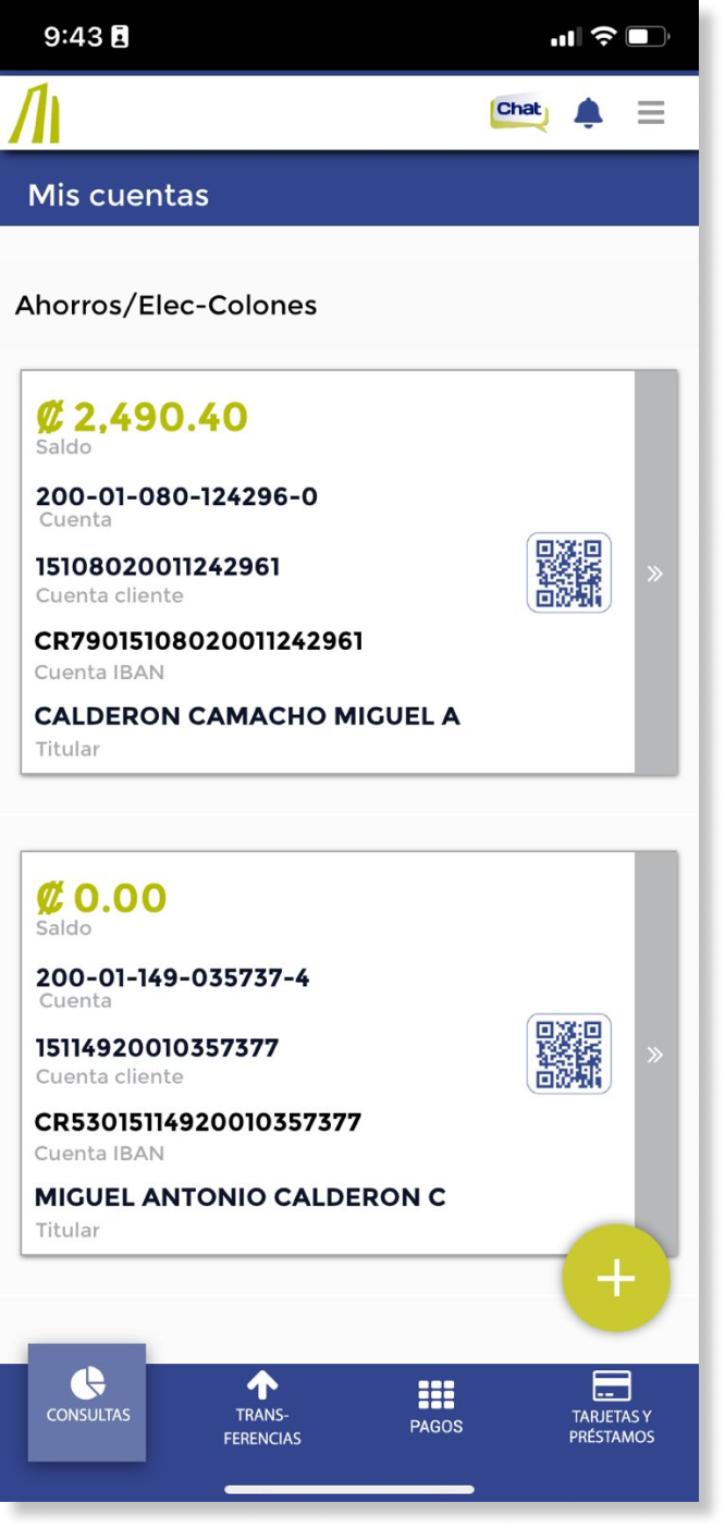
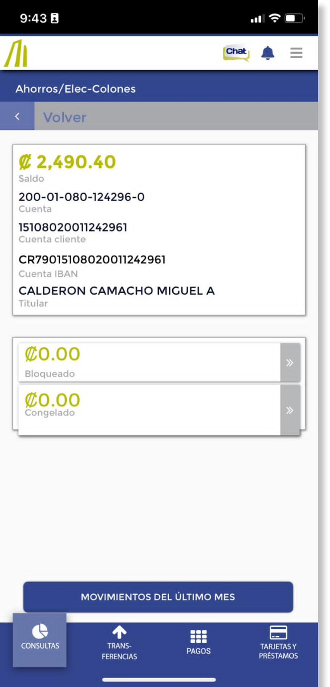
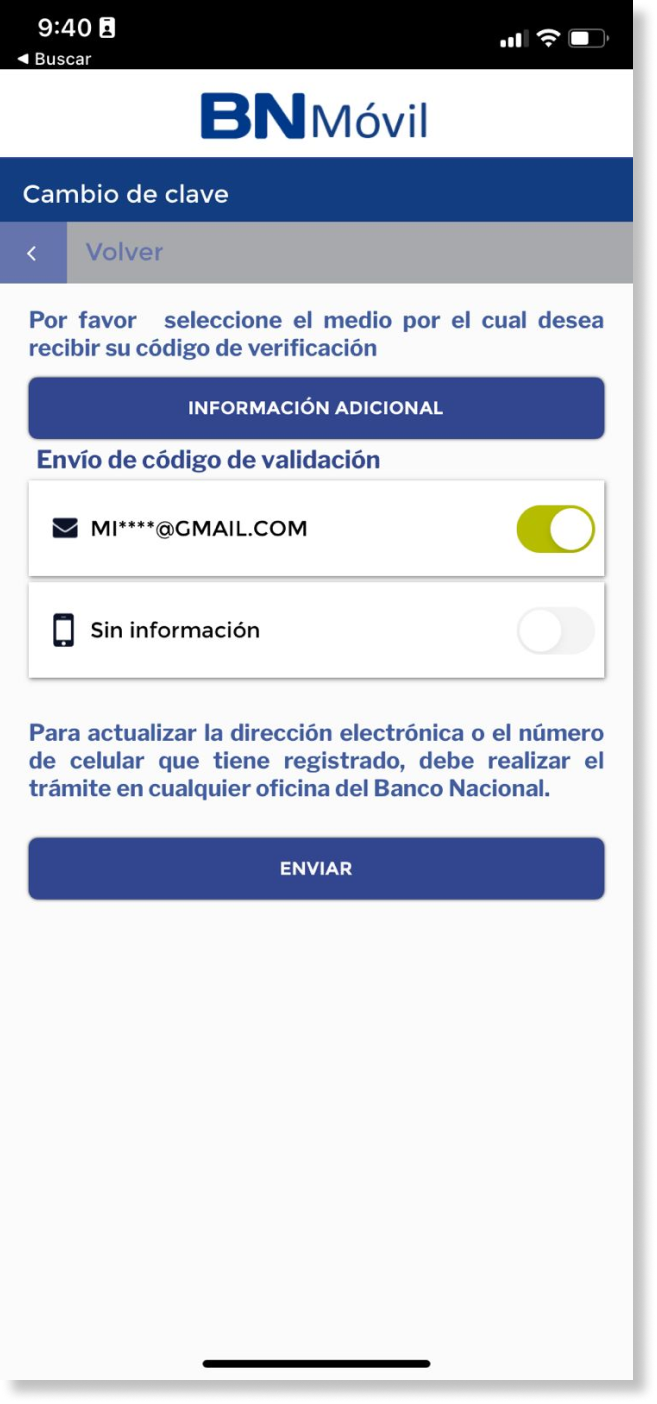
Before diving into the redesign process, a thorough exploration was conducted to understand the existing application's functionalities, their interconnections, and the user navigation patterns. This study involved analyzing the user journey within the application, including the number of steps required to reach specific destinations, button placements, and the visual hierarchy of elements. By identifying strengths and weaknesses in user interaction.
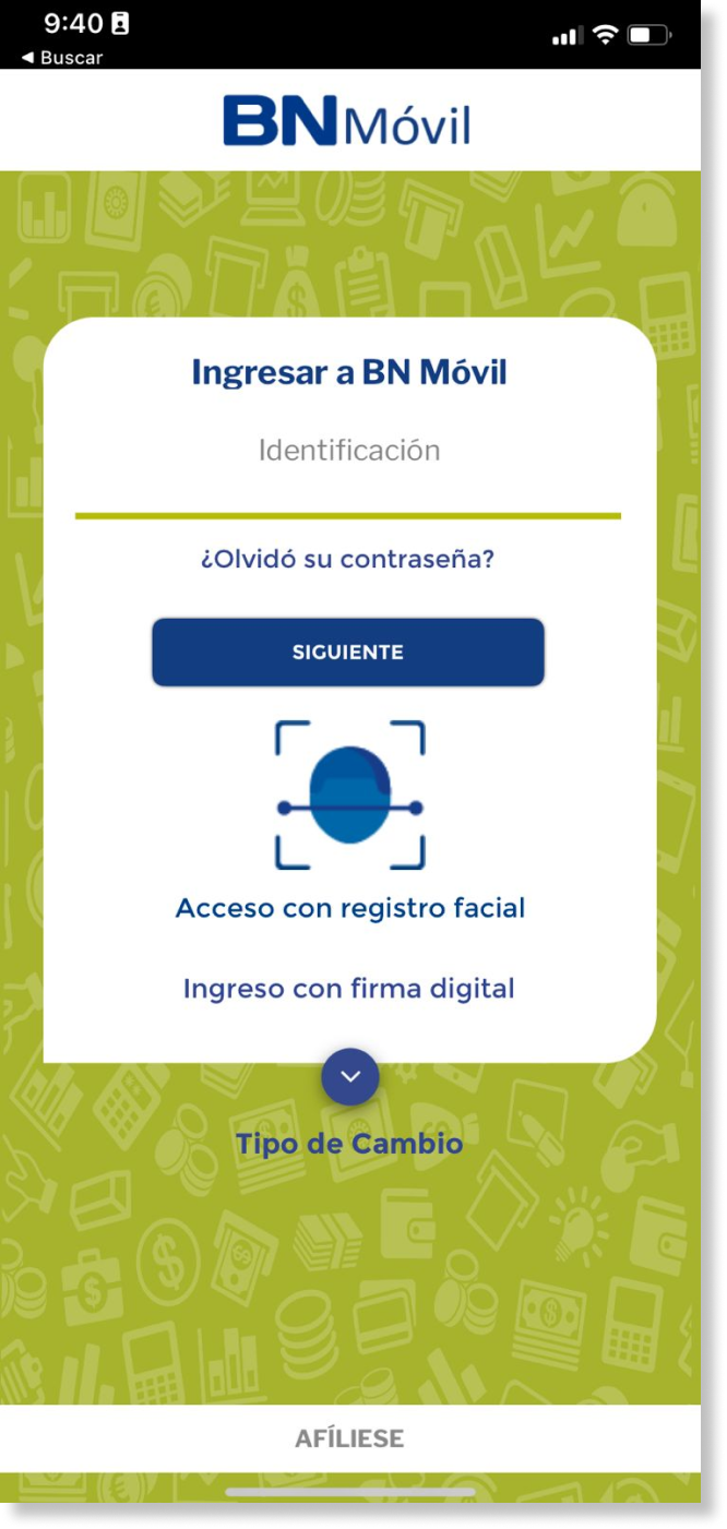
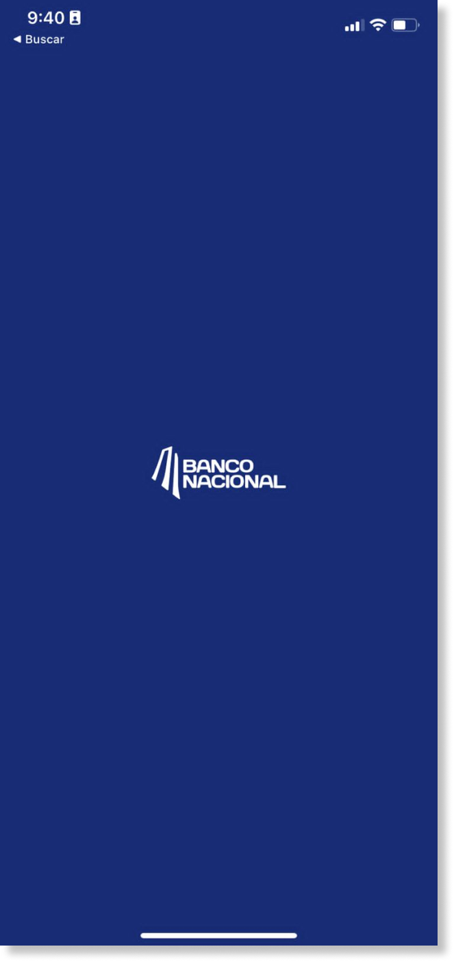


*Screenshots of the current mobile app.

A content inventory was created to gain deeper insights into the user journey within the current app. This inventory involved cataloging and analyzing existing content and navigation paths. By mapping out the content, the project gained a clearer understanding of how users interact with the app and identified areas for improvement to streamline their experience.
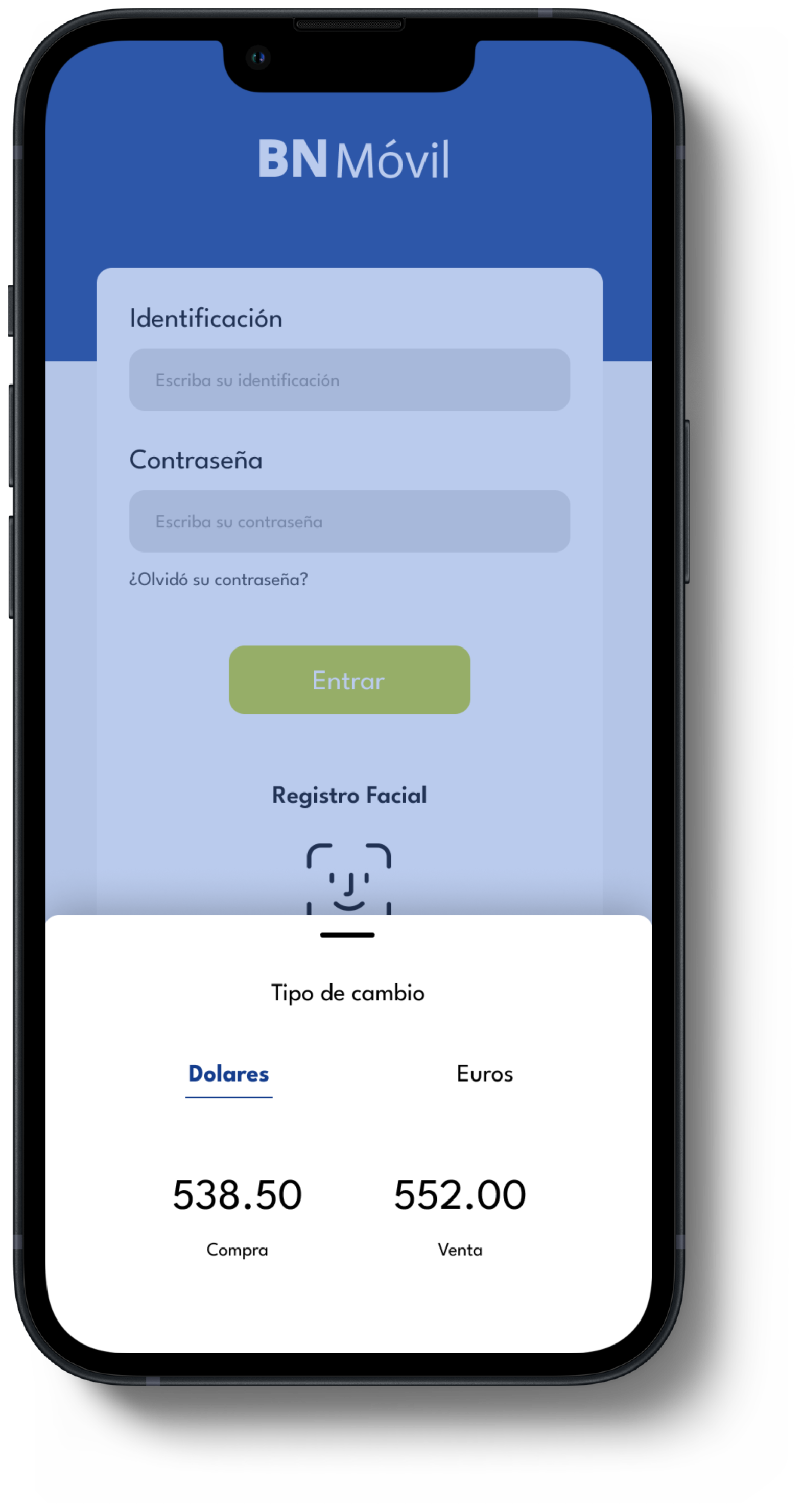
Low Fidelity Wireframes
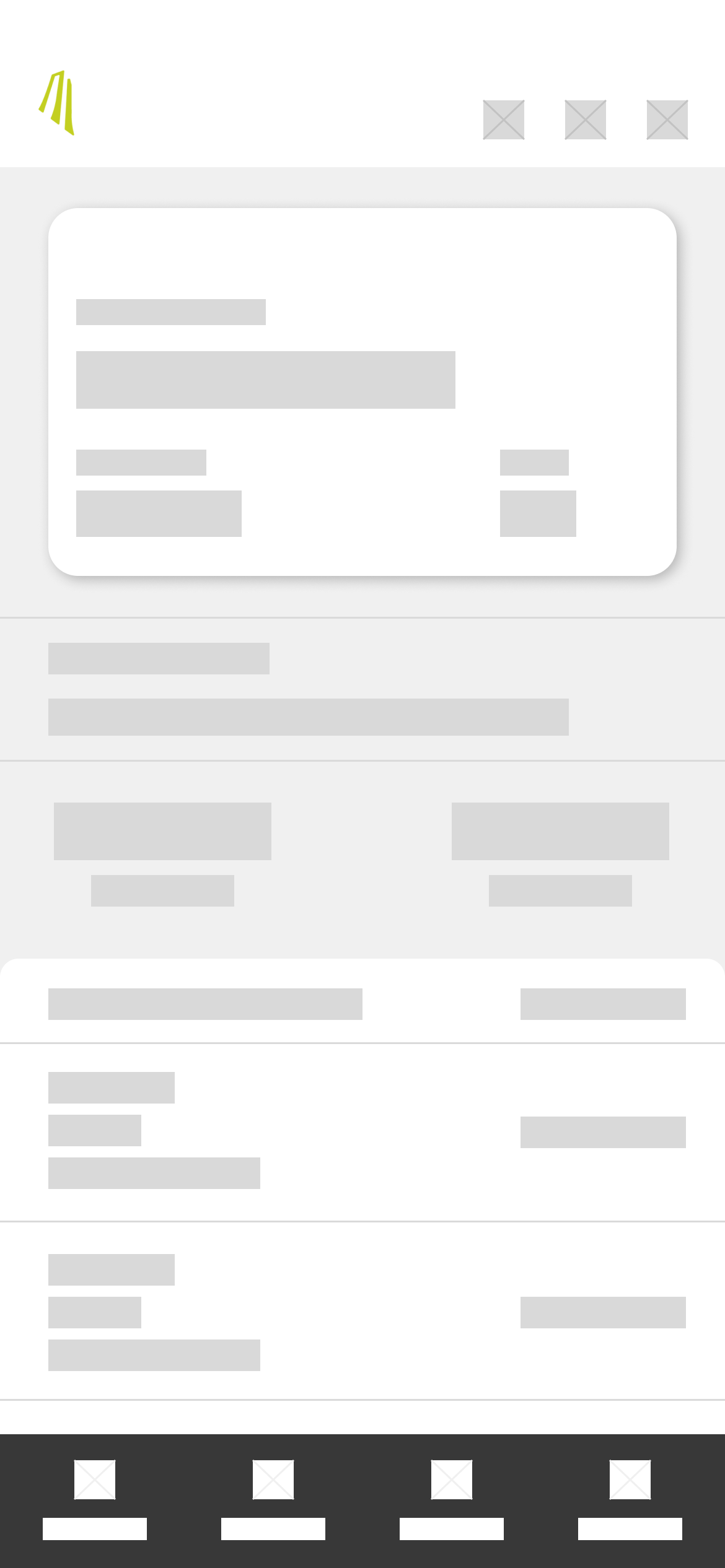
To kickstart the interface design process, I began by creating low-fidelity wireframes. These wireframes served as a foundational visual guide, outlining the general positioning of elements without the distraction of text or color. They provided a basic framework for the eventual placement of elements, focusing solely on visual hierarchies and layout.


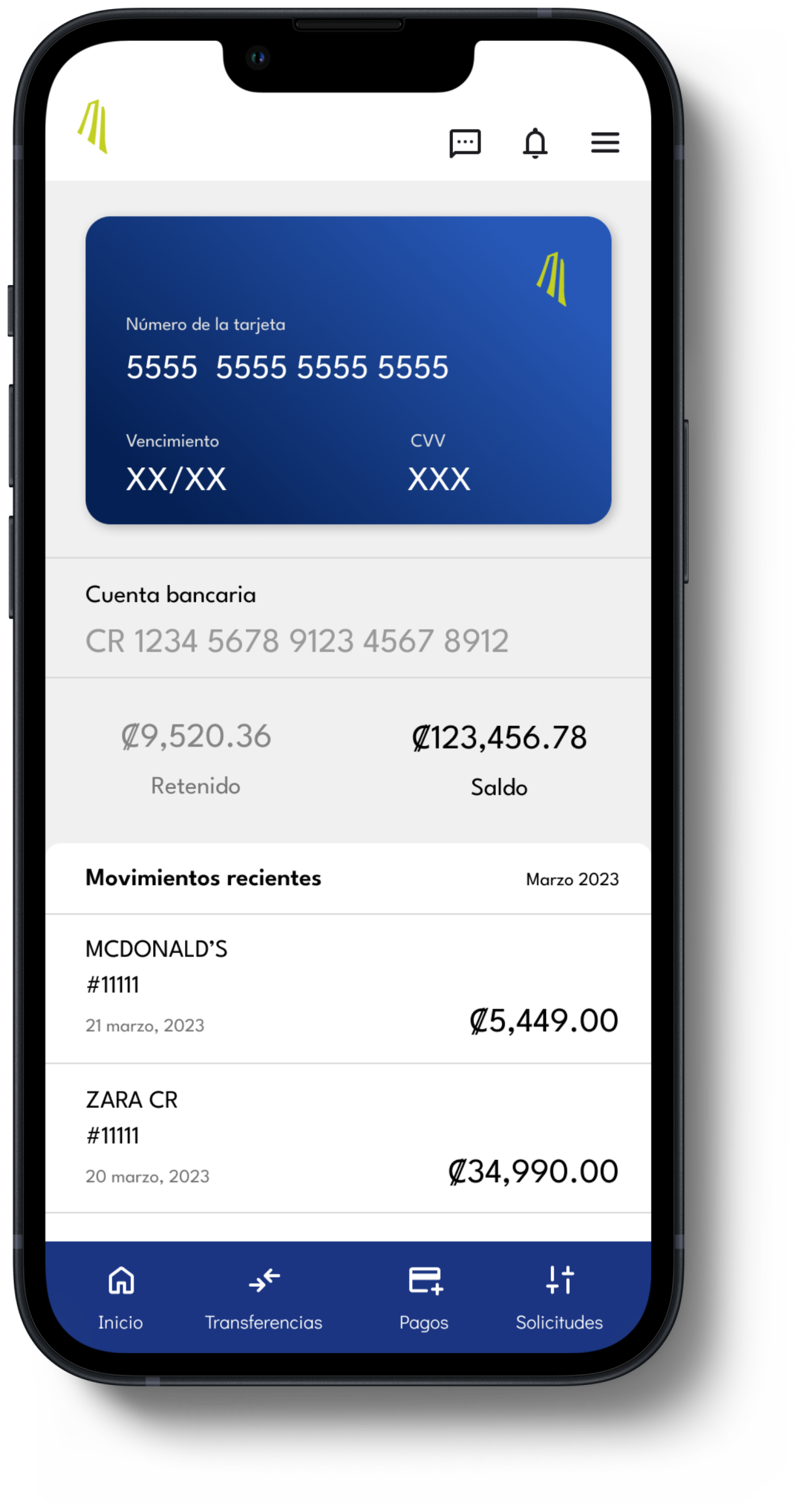
Design System
A design system was created first to unify the visual elements of the application, emphasizing graphical components.
Beginning with a color palette anchored by the brand's signature green, serving as both the primary color and action indicator.
A simple, legible typeface with variable weights was selected to establish clear hierarchies in text sizes.
Furthermore, a guide for buttons, icons, and menus was developed to ensure consistency and harmony throughout the interface design, facilitating seamless user interaction.